Shopify Development
Custom, conversion-focused Shopify storefronts and theme development.
Overview
An online store is measured at the checkout. Every page before it, the homepage, the collection pages, the product page, either builds enough confidence to buy or leaks customers along the way.
We design and build Shopify storefronts for D2C and e-commerce brands, from theme-based builds to fully custom Shopify Hydrogen storefronts. On SATO Eyewear, every product page is treated as a collectible design object, in keeping with frames handcrafted in Japan. On Roark, adventure storytelling and commerce now sit in one journey.
Theme or custom?
It depends on whether your catalogue is doing the selling or your storefront is.
A broad range of standard products usually points to a well-customised theme. It is quicker to launch, costs less and is easier to maintain. A small, curated range where every page has to persuade usually justifies custom work, because the presentation carries the sale.
Who this is for
Brands launching on Shopify for the first time. Brands whose current store looks cheaper than what they sell. Growing brands whose catalogue has outgrown their navigation.
What’s Included
Audit and strategy
UX audit of your current store, covering navigation, mobile and checkout
Competitive analysis of the brands your customers compare you with
Information architecture for collections, filters and navigation that scales with the catalogue
A clear recommendation on theme or custom, with the reasoning
Storefront design
Homepage, collection, product, cart and content page templates
Product pages that answer what buyers need to know before they commit, such as materials, sizing, delivery and returns
Mobile layouts designed with the same care as desktop
Editorial and storytelling sections that carry the brand without slowing the path to purchase
Build
Theme customisation, a custom theme, or a headless Shopify Hydrogen storefront where it is justified
Sections and blocks your team can rearrange in the Shopify editor
App integrations for reviews, subscriptions, search, email and analytics
Product, variant and metafield setup to support the design
Launch
End-to-end checkout and payment testing
Cross-browser and device QA
Redirects, launch support and a handover so your team can run the store without code
How We Work
Audit and scope. For an existing store, we start with a UX audit and a review of navigation, mobile and checkout. For a new one, we map your catalogue, your flows and the features you cannot launch without. Then we recommend theme or custom.
Structure. Navigation and collections are organised around how customers shop, which often differs from how the catalogue is organised internally.
Design. Homepage and key templates first, with the path to purchase as the priority. On SATO, the defining move was making the brand's Fukui manufacturing heritage part of the journey itself.
Build. We develop the theme or storefront, set up products and metafields, and wire in the apps you need.
Test and launch. We test checkout end to end, run device QA, set up redirects and go live.
Refine. After launch there is a short window for fixes. Seasonal launches, new collections and ongoing optimisation can run as small projects or through a monthly retainer.
Scope and pricing
Deliverables, revision rounds, timeline and cost are fixed in a statement of work before we start, so you know what you are getting and when.
Relevant Projects
 SeedWe turned Seed's microbiome science into a digital experience people actually want to read, not skim past.
 SATO EyewearEvery SATO frame is handcrafted in Japan. We designed a digital experience precise enough to match that craftsmanship.
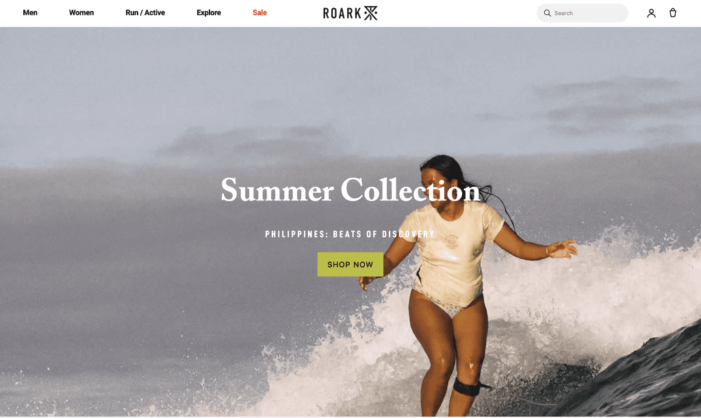 RoarkRoark sells a feeling as much as a product. We redesigned its storefront to bring adventure storytelling and commerce together.


