SATO Eyewear
SATO Eyewear is a luxury eyewear house combining Japanese craftsmanship with bold contemporary design, with every frame handcrafted in Fukui, Japan.
As the collection expanded and the brand attracted a global audience, SATO wanted its storefront to communicate the same refinement, precision, and exclusivity customers felt through its products. The challenges were distinct: communicating craftsmanship visually, justifying premium pricing without becoming overly technical, improving discovery across growing collections, and introducing stronger conversion patterns while preserving a minimal editorial aesthetic.

Client
SATO Eyewear
Services
Shopify Development
Project goals
Rather than refreshing individual pages, we redesigned the complete customer journey so every interaction reflected the precision found in SATO's handcrafted frames.
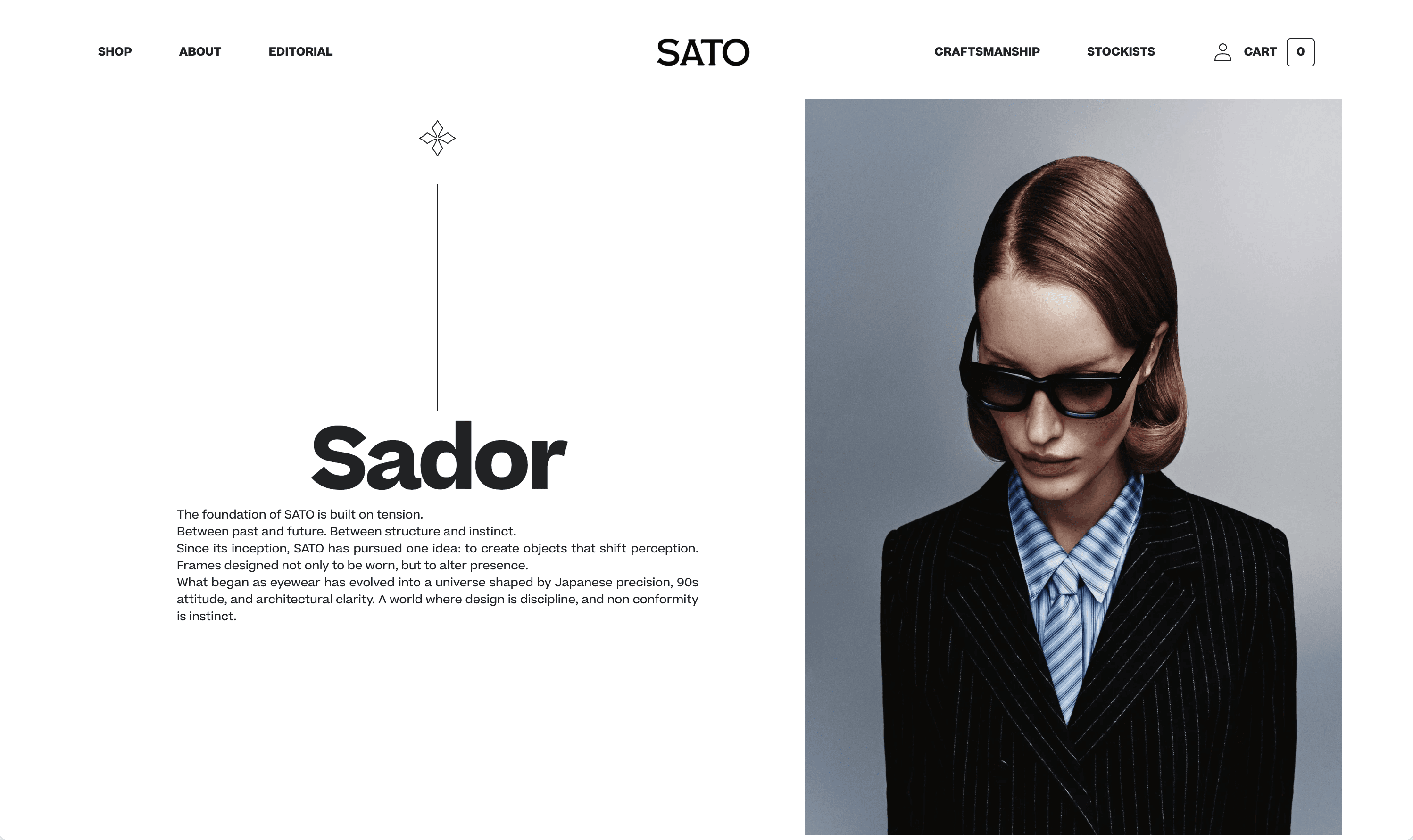
The strategy focused on four objectives: communicate craftsmanship, elevate perceived value, simplify exploration, and increase purchase confidence. We restructured navigation by collection and frame style, built an editorial homepage and showroom-like collection pages, and treated each product page as a collectible design object. A defining move was making SATO's Fukui manufacturing heritage a core part of the journey rather than supporting content.

Result
SATO's storefront now more accurately reflects the craftsmanship, exclusivity, and design philosophy behind its collections.
The redesigned journey made it easier for visitors to discover collections, understand the value of handcrafted Japanese production, and purchase with confidence, while improved information architecture and streamlined browsing reduced friction. The stronger editorial presentation elevated the perceived value of each frame, and a scalable design system now supports future collections, campaigns, and international growth.