website design
Website design styles: a practical comparison
Minimalism, brutalism, glassmorphism, and more: what each website design style is good at, where it breaks down, and who should actually use it.

Website design styles: a practical comparison
Every design style is a trade-off. What makes a portfolio site striking can make a checkout flow frustrating. Here's an honest breakdown of six styles you'll see across the web today, what each one is good at, where it falls apart, and who should actually use it.
Minimalism
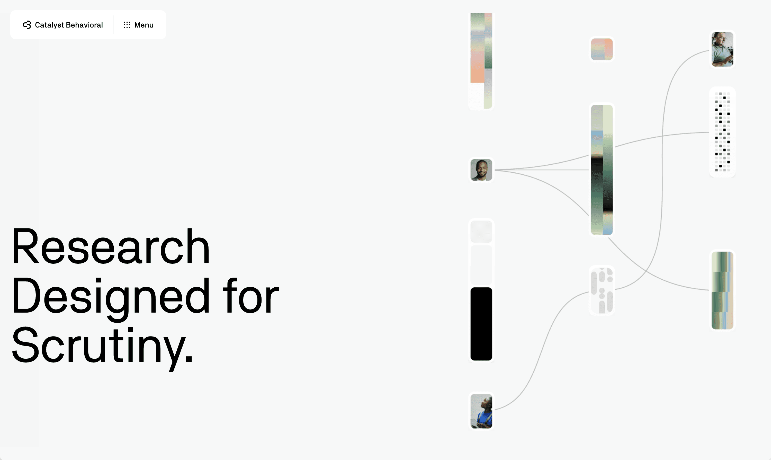
Minimalism strips a design down to what's necessary: generous whitespace, a tight color palette, strong typography, and content that carries the page instead of decoration. Nothing competes for attention, so the few elements that remain matter more.
Examples: Apple's product pages and Muji's e-commerce site are both frequently cited as textbook minimalism, generous white space, a near-monochrome palette, and the product doing all the talking.
Advantages
Fast to load, since there's little to render
Easy to navigate, low cognitive load
Ages well, doesn't look "trendy" or dated in two years
Scales cleanly across devices and screen sizes
Disadvantages
Can feel generic or forgettable if not executed with strong typography and spacing
Leaves little room to hide weak content, since every word and image is exposed
Can read as "cold" for brands that want warmth or personality upfront
Who it's for: SaaS products, startups, professional services, and any brand where clarity and conversion matter more than spectacle.
Who it isn't for: Entertainment, fashion, or music brands that need to express mood and energy immediately.
Brutalism
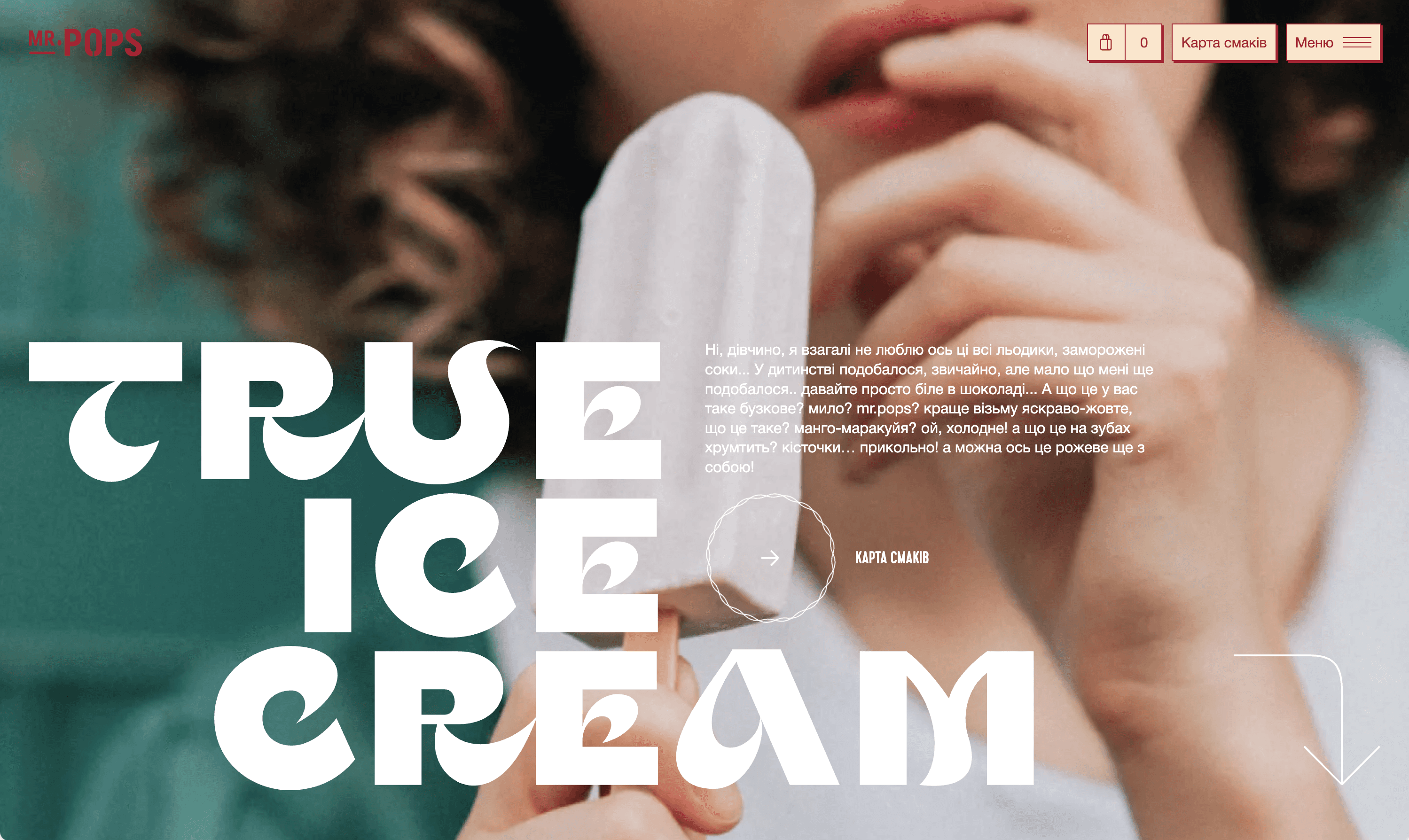
Brutalism borrows from raw, unpolished web and print design: bold or oversized type, harsh grids, visible structure, high contrast, and a deliberate rejection of "smooth" modern UI conventions. It looks unfinished on purpose.
Examples: Craigslist and Hacker News are the canonical cases, plain HTML, no visual polish, and both have stayed essentially unchanged for over a decade because the raw look was never the point, functionality was.
Advantages
Impossible to ignore, strong first impression
Signals a brand isn't afraid to break convention
Genuinely fast to build and load, since it avoids heavy visual effects
Stands out hard in a sea of similar-looking SaaS sites
Disadvantages
Can hurt usability if taken too far; contrast and hierarchy get sacrificed for aesthetic
Alienates users who read it as "broken" rather than "intentional"
Rarely appropriate for anything transactional or trust-dependent, like finance or healthcare
Who it's for: Creative studios, portfolios, music and culture brands, or startups deliberately positioning against a polished, corporate look.
Who it isn't for: Enterprise software, financial products, healthcare, or anything where users need to feel immediate trust and familiarity.
Glassmorphism
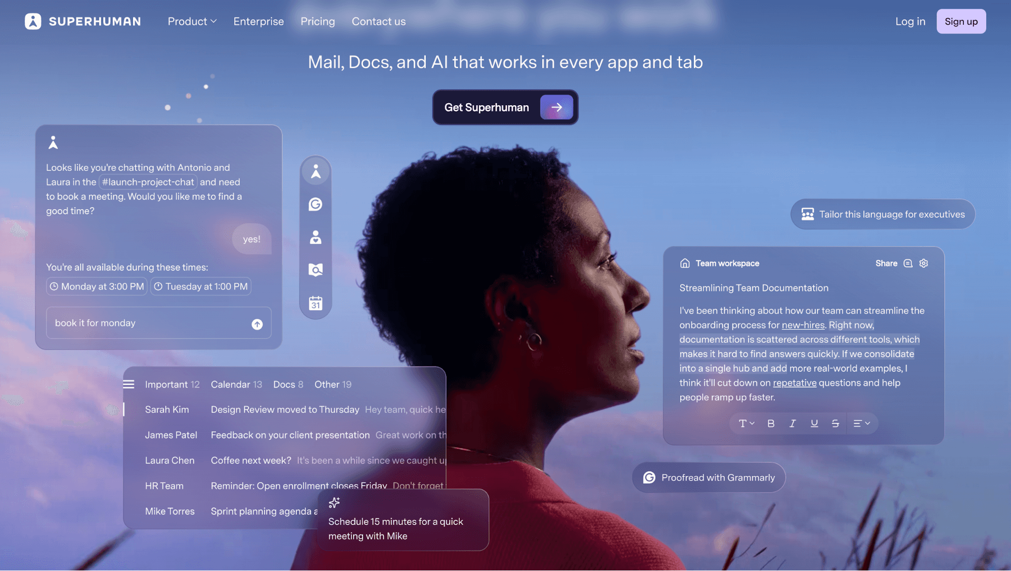
Glassmorphism layers translucent, frosted-glass panels over colorful or blurred backgrounds, usually with soft shadows and thin borders to suggest depth. It became popular through iOS and Windows interface design.
Examples: Apple's macOS Control Center and visionOS, and Microsoft's Fluent Design system in Windows, are the two clearest large-scale implementations, frosted panels layered over blurred backgrounds to suggest depth.
Advantages
Visually distinctive, feels modern and premium when done well
Creates a real sense of depth and layering in an interface
Works especially well for dashboards, cards, and overlays
Disadvantages
Can hurt readability if text sits on a low-contrast blurred background
Blur effects are expensive to render, which can hurt performance on lower-end devices
Easy to overuse; a little goes a long way, a lot looks messy
Who it's for: Product dashboards, fintech apps, and interfaces that want a premium, tech-forward feel without going fully minimal.
Who it isn't for: Content-heavy sites like blogs, documentation, or e-commerce, where readability has to come first.
Neumorphism
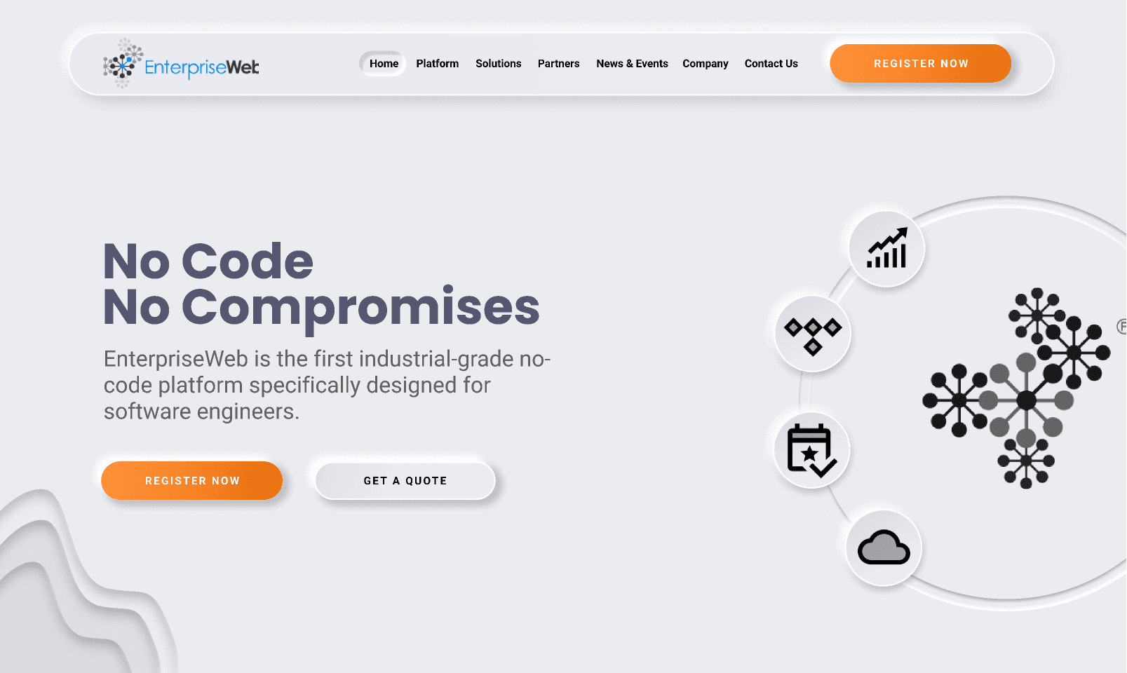
Neumorphism ("soft UI") uses subtle shadows and highlights on a single-color background to make elements look like they're extruded from or pressed into the surface, mimicking physical buttons and switches.
Examples: Genuinely rare as a full live website. Its real footprint is small UI accents inside otherwise ordinary products, a soft toggle here, an extruded button there, rather than an entire site built this way. That scarcity is itself the clearest signal of how the trade-offs below play out in practice.
Advantages
Distinctive, tactile look that feels soft and approachable
Can work well for isolated UI elements like toggles, sliders, and buttons
Disadvantages
Serious accessibility problem: low contrast between elements and background makes it hard for many users to tell what's clickable
Doesn't scale well across a full site; works better as an accent than a system
Fell out of favor quickly after its 2020 peak, so it can read as dated
Who it's for: Small, isolated UI components or apps where a soft, tactile feel is the entire point, like a meditation or wellness app.
Who it isn't for: Any full website or product where accessibility and clear affordance matter, which is most of them.
Maximalism
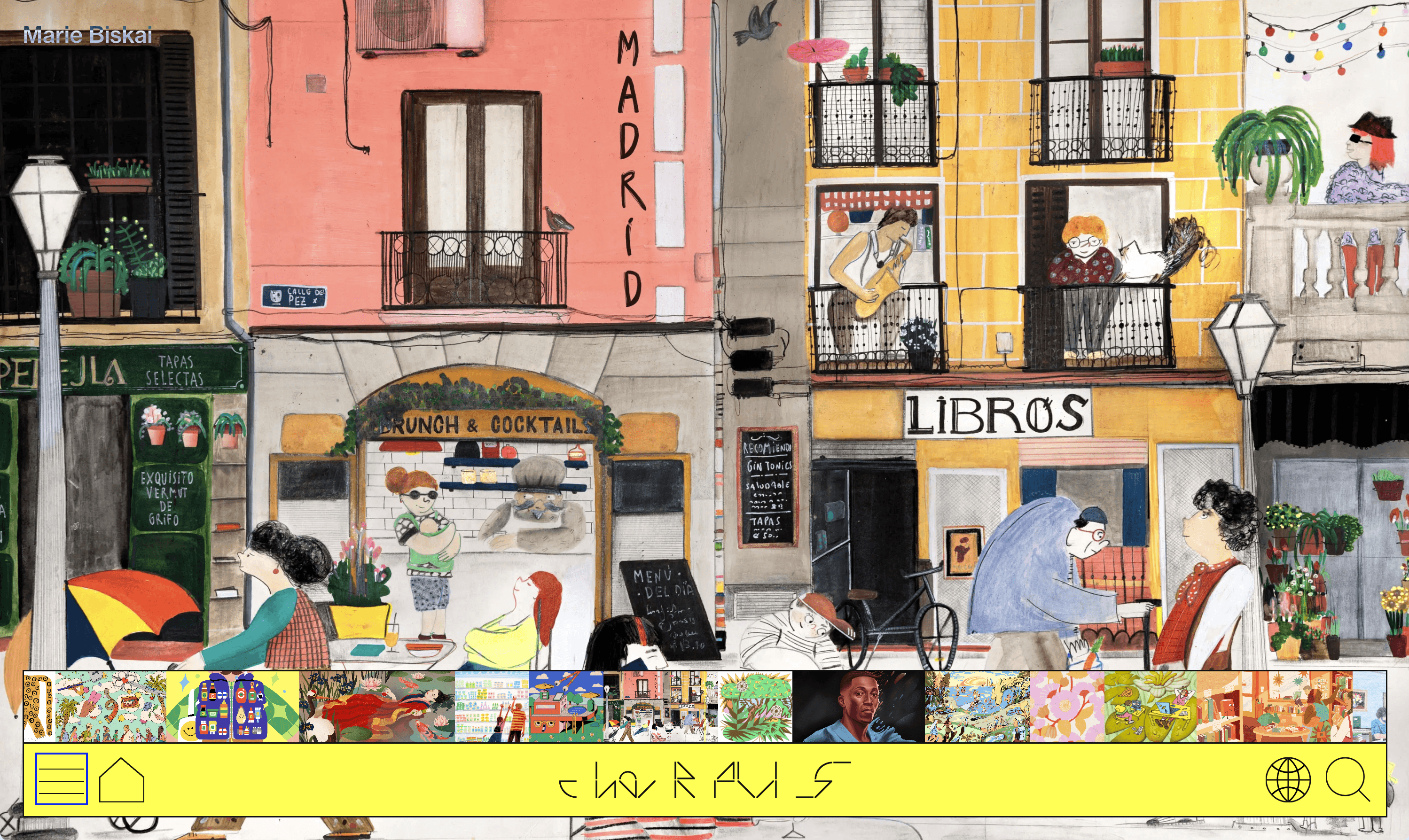
Maximalism is minimalism's opposite: bold color, layered typography, dense imagery, animation, and a willingness to fill the page. Done well, it feels energetic and alive instead of cluttered.
Examples: Gucci's site leans into mixed typefaces and bold visual statements as brand strategy, and Oatly treats its homepage like an editorial magazine, oversized custom type and self-aware copy replacing the usual product-grid layout.
Advantages
Highly memorable and expressive, strong brand personality
Great for storytelling and immersive, editorial-style pages
Differentiates hard in categories full of minimal, look-alike competitors
Disadvantages
Easy to get wrong; the line between "bold" and "cluttered" is thin
Usually slower to load, given the volume of assets and animation
Harder to keep consistent as a design system scales across many pages
Who it's for: Fashion, entertainment, events, and consumer brands that sell an experience or a feeling, not just a product.
Who it isn't for: B2B SaaS, enterprise tools, and anything where the user's goal is to get in, complete a task, and get out.
Retro & Y2K revival
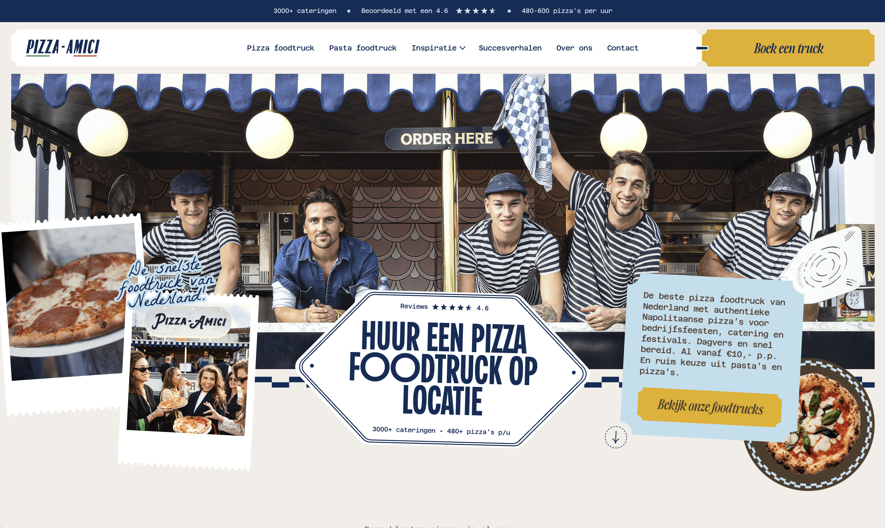
This style pulls from late-90s and early-2000s web and computing aesthetics: chunky gradients, bevels, pixel fonts, bright saturated color, and a knowing, nostalgic tone. It's grown fast alongside broader Y2K fashion and culture trends.
Examples: Lush and Headspace are both called out as current, mainstream brands leaning into this palette, neon gradients and high-contrast color standing in for the muted tones that dominated the previous decade of web design.
Advantages
Instantly recognizable and culturally current, especially with younger audiences
Cheap to make feel authentic, since the aesthetic embraces imperfection
Strong differentiator in categories where everyone else looks the same
Disadvantages
Trend-dependent; what feels fresh now can feel stale once the cultural moment passes
Can undercut credibility for brands that need to feel established or serious
Balancing nostalgia with usability takes a genuinely skilled hand
Who it's for: Gen Z-facing consumer brands, music, streetwear, and culture-driven products that want to feel playful and current.
Who it isn't for: B2B products, financial services, or any brand whose audience equates "serious" with "trustworthy."
The bottom line: style should follow function. The right question isn't "which style looks best" but "which style serves what this specific audience needs to feel and do." A fintech dashboard and a streetwear drop site are not solving the same problem, so they shouldn't reach for the same aesthetic.